
When it comes to printing, the difference between “good enough” and truly professional results often comes down to one thing: your artwork setup. Whether you’re printing business cards, flyers, posters, labels, or custom stationery, the quality of your final print is only as strong as the file you provide.
At Print by Sassy, we’ve worked with countless clients—from first-time designers to seasoned brands—and we’ve seen the same issues come up time and time again. The good news? With a few simple adjustments and best practices, you can dramatically elevate the quality of your prints and avoid costly mistakes.
Here’s your complete guide to creating artwork that prints beautifully every single time.
1. Start with the Right Dimensions
One of the most common mistakes is designing artwork at the wrong size. Always set up your document to match the final print size from the start.
For example:
- Business cards: 90mm x 50mm
- A5 flyer: 148mm x 210mm
- A4 document: 210mm x 297mm
Designing at the correct size ensures that your layout, spacing, and proportions remain accurate when printed.
Pro tip: Avoid designing in pixels unless you’re very confident in your DPI settings. Always use millimetres for print work.
2. Don’t Forget Bleed (It’s More Important Than You Think)
If your design includes colours, images, or backgrounds that go all the way to the edge, you must include bleed.
What is bleed?
Bleed is an extra margin (usually 3mm) added around your artwork to ensure there are no white edges after trimming.
So if your flyer is:
- Final size: 210mm x 297mm
- With bleed: 216mm x 303mm
Without bleed, even a slight trimming shift can ruin the final result.
3. Keep Important Content Within Safe Margins
While bleed extends your artwork outward, safe margins protect your content inward.
Keep all important elements (text, logos, contact details) at least 5mm away from the edge. This ensures nothing gets accidentally trimmed off during finishing.
4. Use High-Resolution Images Only
Blurry prints are almost always caused by low-resolution images.
For professional print:
- Use images at 300 DPI (dots per inch)
- Avoid screenshots or images pulled from WhatsApp or social media
- Never stretch small images to fit larger spaces
If an image looks slightly blurry on your screen, it will look even worse when printed.
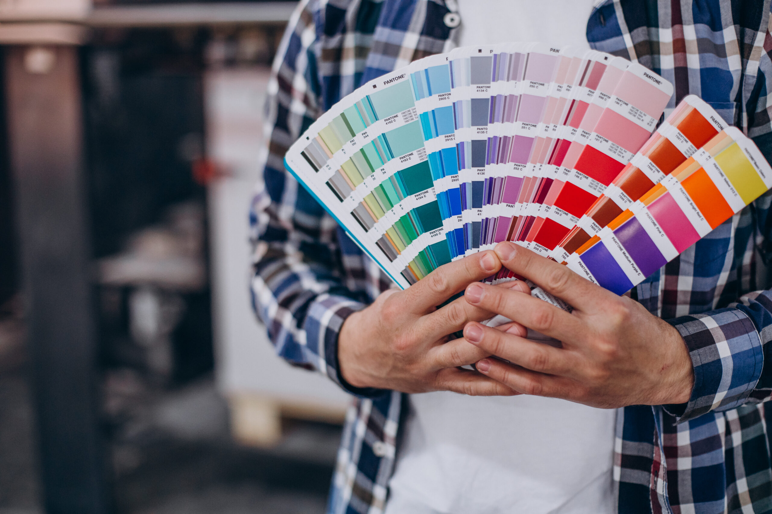
5. Always Design in CMYK, Not RGB
This is a big one.
- RGB is for screens (phones, laptops, TVs)
- CMYK is for printing
If you design in RGB, your colours may shift when printed—often becoming duller or slightly different than expected.
By designing in CMYK from the start, you get a much more accurate representation of how your final print will look.
6. Choose Fonts Carefully (and Embed Them)
Fonts can make or break your design—but they can also cause technical issues if not handled properly.
Best practices:
- Use clean, readable fonts
- Avoid using too many font styles in one design
- Convert text to outlines or embed fonts before exporting
This ensures your text doesn’t change or break when opened on another system.
7. Use Proper File Formats
When submitting artwork for print, the format matters.
Recommended formats:
- PDF (preferred) – ensures layout, fonts, and quality stay intact
- AI / PSD – if editable files are required
- JPEG/PNG – only if high-resolution and properly set up
Always export at high quality with compression turned off or minimized.
8. Pay Attention to Colour Contrast
What looks good on screen doesn’t always translate well to print.
Watch out for:
- Light text on light backgrounds
- Dark colours blending together
- Low contrast combinations
Strong contrast improves readability and gives your prints a more polished, professional finish.
9. Avoid Overcrowding Your Design
More content doesn’t always mean better design.
Professional prints use:
- White space strategically
- Clear visual hierarchy
- Balanced layouts
Give your content room to breathe. A clean design not only looks better—it communicates more effectively.
10. Double-Check Everything Before Sending
Before you send your artwork to print, take a few minutes to review:
- Spelling and grammar
- Contact details (phone, email, address)
- Alignment and spacing
- Image quality
- Correct sizing and bleed
One small mistake can lead to a full reprint—so this step is crucial.
11. Understand Finishes and Materials
Your artwork should complement the final print finish.
For example:
- Matte finishes give a soft, elegant look
- Gloss finishes enhance colours and shine
- Textured papers add a premium feel
Design choices like colour intensity and contrast can look very different depending on the material you choose.
12. Work With Your Printer (Don’t Guess)
One of the best ways to get professional results? Communicate with your printer.
At Print by Sassy, we’re always happy to:
- Check your artwork before printing
- Advise on sizing, bleed, and formatting
- Recommend finishes and materials
- Help fix common issues
You don’t have to figure everything out on your own.
Final Thoughts
Great printing isn’t just about having a good design—it’s about preparing that design correctly for print.
By following these artwork tips, you’ll:
- Avoid common printing mistakes
- Save time and money
- Achieve clean, sharp, professional results every time
Whether you’re printing for your business, an event, or personal use, attention to detail makes all the difference.
Need Help With Your Artwork?
If you’re unsure about your setup or want a professional touch, Print by Sassy is here to help. From basic print jobs to fully branded materials, we’ll make sure your prints come out exactly how you envisioned—if not better.
Get in touch today and let’s bring your ideas to life.